Posts

Image
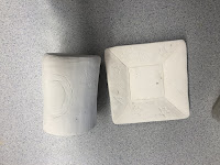
Altered thrown piece      Describe: This is my altered thrown piece. How I altered my    thrown bowl was by adding a handle. I made the bowl first and then used slip on the outside of the bowl to help the handle attach. I took a little piece of clay and rolled it into a cylinder shape and formed it to curve into a handle shape. For now the cup is grey but I hope to glaze it after it is fired.      Analyze: There is not much character in this piece but one principle of design you could say would be emphasis. There would be emphasis in the handle of the piece because that is what you first notice when you look at the piece.      Interpret: I used my common knowledge when creating this piece of what a cup would look like. Even though it is not entirely shaped like a cup and was formed in a bowl shape, since there is a handle you could potentially use it as a cup.     Judge: This piece is very plain but has potential . This was my first time making something like this
Image
Utilitarian piece      Describe: My utilitarian piece Is a leaf green jewelry holder. The leaf is 3-D mold that can fit rings    and necklaces and bracelets. I painted it green since it was a leaf shape so the color goes with the nature theme. The leaf is shaped jagged and has indents in it to make it seem more realistic since it is 3-D.        Analyze: A principle of design for this piece would be balance. Balance is in this piece how both sides of the leaf are jagged but jagged similarly so one side doesn’t look exactly different than the other. The color is also the same throughout the piece.        Interpret: This piece was created to be a holder for jewelry. It symbolizes a leaf but is in the shape of a bowl since it’s caved in. I have always seen the leaf mold and thought it would be cool to make a piece I could use out of the mold and I thought this project would be perfect for the leaf mold.         Judge: I sort of like this piece. I like the meaning behin
Image
  Thrown piece    Describe- This piece is what I made on the wheel. When it was first taken off the wheel it was a grey clay color before it was fired. Just like any other piece I thought it would be fun to glaze it even though it was a really simple piece. I decided to glaze it in almost a camo pattern. The colors look pastel before it will be fired for the second time but it will turn out bright and colorful. I was able to finish this piece earlier it just hasn’t gone through the kiln.    Interpret- There is no exact interpretation for this piece. There was no exact reference either since I came up with the glaze idea in my head. The shape and size of the piece is around the normal size of any thrown bowl so there is no specific reference for that.    Analyze- One principle of design for this piece would be contrast. There would be contrast in this piece with all of the different colors next to each other. I chose to do different colors so each individual color woul
Image
Rough drafts: Green wear stage: Reference:    For my principle of design project I didn’t have a certain reference of an artist I went off of. I thought of the idea of making a bowl with a spiral illusion because I thought it would have a cool effect. My principle of design was movement because your eyes move in a spiral around the piece. My piece hasn’t been fired yet so I don’t have a final picture of it glazed.  Describe: The goal for my piece is to create a black and white spiral effect on a bowl. There are many cut outs in the bowl that I will be coloring to crate the illusion. If you spin the bowl around the goal is for it to look like the spinning spiral illusion. The design of the bowl is very basic but I didn’t want to add too much to it because I wanted to focus on the movement of the piece and the illusion.  Analyze: The principle of design my piece focuses on is movement. The spiral black and white illusion creates a movement effect. Even if yo

Cup and Plate Project

Image
                                                                       Green-wear:                                                                glaze but not through kiln:    Describe: This is my Cup and Plate project. For my Theme i did the night sky. I used a black gloss glaze for the base color and outlined the stars and moon and colored them in with yellow gloss glaze. i used a pen tool to draw the mood and the stars. when i was painting the stars it was very challenging to keep the star shape, so the stars on the plate look like yellow orbs. i created the plate using a plate mold and letting the clay dry on top of it then taking it off. For the cup, i look a large flat piece of clay and connected it end to end then made a circular base then attached it.   interpret: The reason why i chose to do this theme of the night sky was because i love the night tune and i find the stars and moon very fascinating. The moon and stars were free handed and not inspired by any certa
Image
rough draft  inspiration  final draft Description: In this piece i decided to do the quote “every rose has its thorns just like every night has its dawn”. i did the words thorn and dawn in a bold font and the rest of the words a less bold cursive font. the background is radiant from dark to light. for the visuals representing the quote i drew rose thorns on a stem with a rose petal to the left. For the night part of the quote i drew a moon with stars to the left of that, and a rising sun representing dawn. analysis: one principle of design in the piece is emphasis. there is emphasis on the quote because it is darker and more bold than the background and so is the lettering. there is also contrast between the light and dark of the background . there is more contrast also between the subjects of the piece where it’s more of a dark and sad subject then it turns into a light and happy subject. interpretation: this piece symbols that everything bad in love will eventu
Image
Rough draft/Reference Pictures inspiration-Artist Reference  Jeff Koons -Jeffrey Koons is an American artist known for working with popular culture subjects and his reproductions of banal objects, such as balloon animals produced in stainless steel with mirror-finish surfaces. He is he artist who created the balloon dog sculpture. I took his balloon sculpture and created my own version of it creating a giraffe like balloon animal. Final piece My final piece is a orange balloon giraffe. The balloon giraffe is bouncing on balloon flowers with balloon clouds in the sky. I colored the flowers pink and green and the clouds grey. There is a reflection on all of the balloon drawings to help the drawings look more like balloons. One principe of design i used in this piece is emphasis. There is emphasis on the giraffe because it is the biggest and brightest part of the piece. Another principle of design is contrast. There is contrast within the background and every